ShoMe Horse Shows
CLIENT: ShoMe Horse Shows
CATEGORIES: Branding
ROLE: Brand Identity, Logo Design, One Page Guidelines
Tools: Adobe Illustrator
ShoMe Horse Shows is a widely recognized and well attended equine event series in Michigan (events include Spring ShoCase, Summer ShoStopper, and The Championship Sho). They needed a refreshed umbrella brand and unique sub-event identities to attract attendees, sponsors, and exhibitors while maintaining consistency across the series.
ShoMe Horse Shows — Logo Refresh
ShoMe Horse Shows is a well-established horse show series with a recognizable visual identity. When new ownership took over the series, they wanted to refresh the brand while preserving the elements longtime exhibitors and spectators already associated with ShoMe. The goal was to create a versatile logo suite that could be used consistently across social media, web, print collateral, awards, and promotional giveaways. The existing logos shared a common “Sho” typeface and the iconic horse peeking through the “O,” but relied on dated effects and inconsistent execution.
The ask: Create an updated logo suite and color palette that honors the original ShoMe Horse Shows identity while incorporating the refined “Sho” typeface and horse graphic from the Holiday ShoDown logo. The refresh needed to feel more modern while still reflecting the heritage of the brand. The client requested a primary logo featuring gold, along with flat and one-color variations suitable for embroidery, specialty printing, and giveaway imprinting. The heavy 3D effects and overly detailed horse graphic in the original logo needed to be simplified and modernized.
The result: The “Sho” lettering and horse icon were rebuilt using the Holiday ShoDown design as a foundation, creating a cleaner and more cohesive update to the Horse Shows logo. A cooler burgundy was introduced to modernize the palette, paired with a gold foil effect to add elegance and visual impact. “Horse Shows” was set within a gold bar to ground the horse icon and provide structure, resulting in a logo system that feels polished, versatile, and respectful of the brand’s legacy.
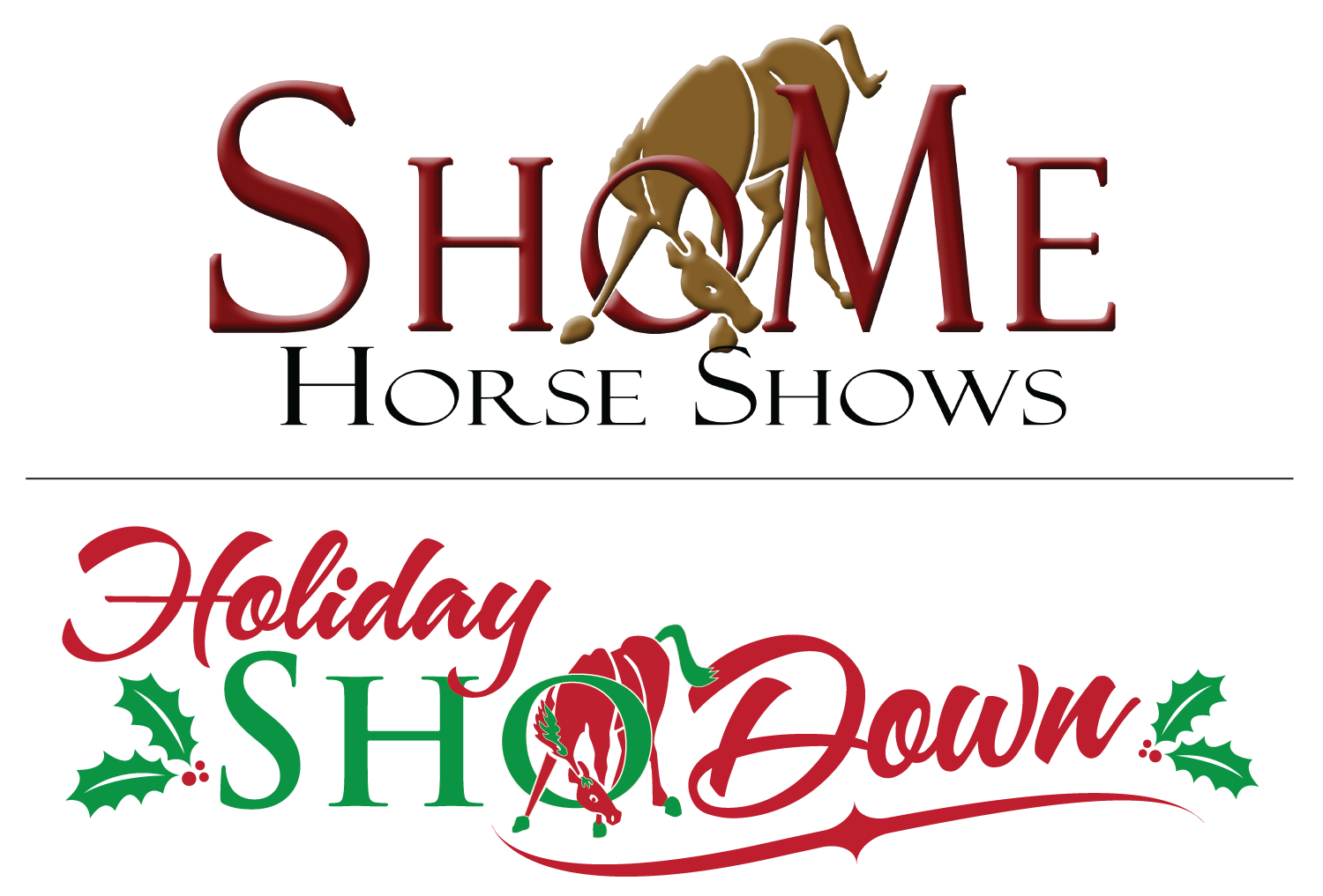
Previously Existing ShowMe Horse Shows and Holiday ShoDown Logos
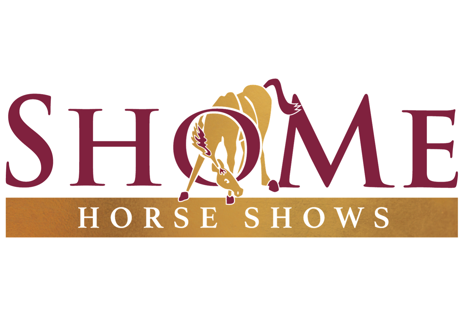
Updated ShoMe Horse Shows Logo
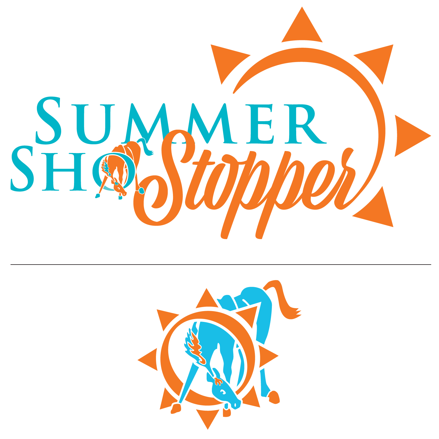
Summer ShoStopper
As the ShoMe Horse Shows series expanded, the client introduced additional events beyond their flagship shows. Building on the success of the Holiday ShoDown branding, they wanted a distinct yet cohesive identity for their first new event: Summer ShoStopper.
The ask: Create a vibrant, summer-inspired brand that clearly differentiates the event while maintaining strong visual ties to the ShoMe series. The logo needed to incorporate the trademark “Sho” lettering with the horse peeking through the “O,” and include a standalone graphic element similar to the Holiday ShoDown wreath—allowing the “O” to function independently for giveaways, social graphics, and collateral use.
The result: Several concepts were explored, with a bold orange-and-blue logo featuring a sun selected as the final mark. The palette reflects the deep blue of a summer sky paired with the warm glow of the sun, creating a high-energy, seasonal feel. The sun arcs upward and around the wordmark, guiding the viewer’s eye back through the composition. This sun element was also integrated into the standalone “O” icon, providing a flexible graphic used across promotional materials, giveaways, and event collateral.
Spring ShoCase
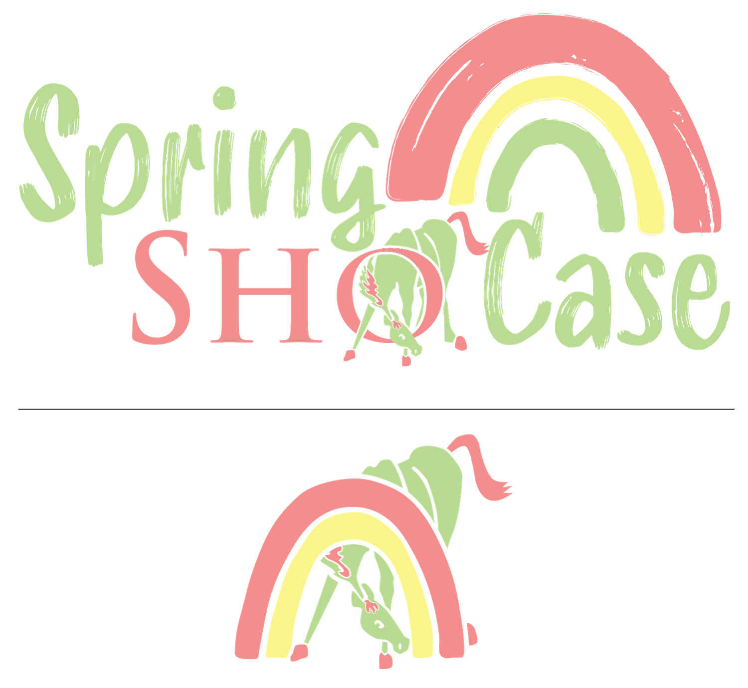
As the ShoMe Horse Shows series continued to grow, the client introduced a spring kickoff event: Spring ShoCase. The branding needed to feel distinct from the summer and holiday shows while remaining cohesive within the overall ShoMe visual system.
The ask: Create a logo that captures the freshness and creativity of spring through muted pastel tones and an artistic, hand-crafted feel. The design needed to incorporate ShoMe’s trademark “Sho” lettering with the horse peeking through the “O,” while introducing a simplified graphic element that could stand alone for use across social media, print collateral, and promotional items. The client envisioned a look inspired by watercolor or painted textures—light, expressive, and seasonal.
The result: Several concepts were explored before landing on a calming palette of green, salmon pink, and yellow. A textured type treatment paired with a painted rainbow creates a playful, artistic contrast to the structured “Sho” wordmark. The rainbow symbolizes growth and new beginnings, aligning with Spring ShoCase as the kickoff event for the season. Moving beyond a traditional circular icon, the rainbow was integrated into the standalone “O” graphic, providing a flexible mark used across giveaways and supporting collateral.
The Championship Sho
The most recent addition to the ShoMe Horse Shows series, The Championship Sho, was created as a culminating event that brings together top competitors from the season’s previous shows. As the finale of the series, the branding needed to feel elevated, celebratory, and clearly positioned as the highest level of competition.
The ask: Create a logo that closely aligns with the ShoMe Horse Shows umbrella brand while conveying a strong championship presence and sense of prestige.
The result: The final logo builds on the established gold and maroon palette of the ShoMe brand, reinforcing continuity across the series. A laurel wreath and three stars were introduced to symbolize achievement and excellence, elevating the mark while maintaining a classic, competitive feel. These elements were also adapted into a standalone graphic featuring the horse icon, providing a flexible asset for promotions, giveaways, and event collateral.